Waterwegen Wegen
2009
Public Artwork for Rijkswaterstaat, Goes [NL],
Client: Atelier Rijksbouwmeester.
Urban reality as picture book of desires (Xandra de Jongh, published in ‘Smaak’, series 9, issue 43)
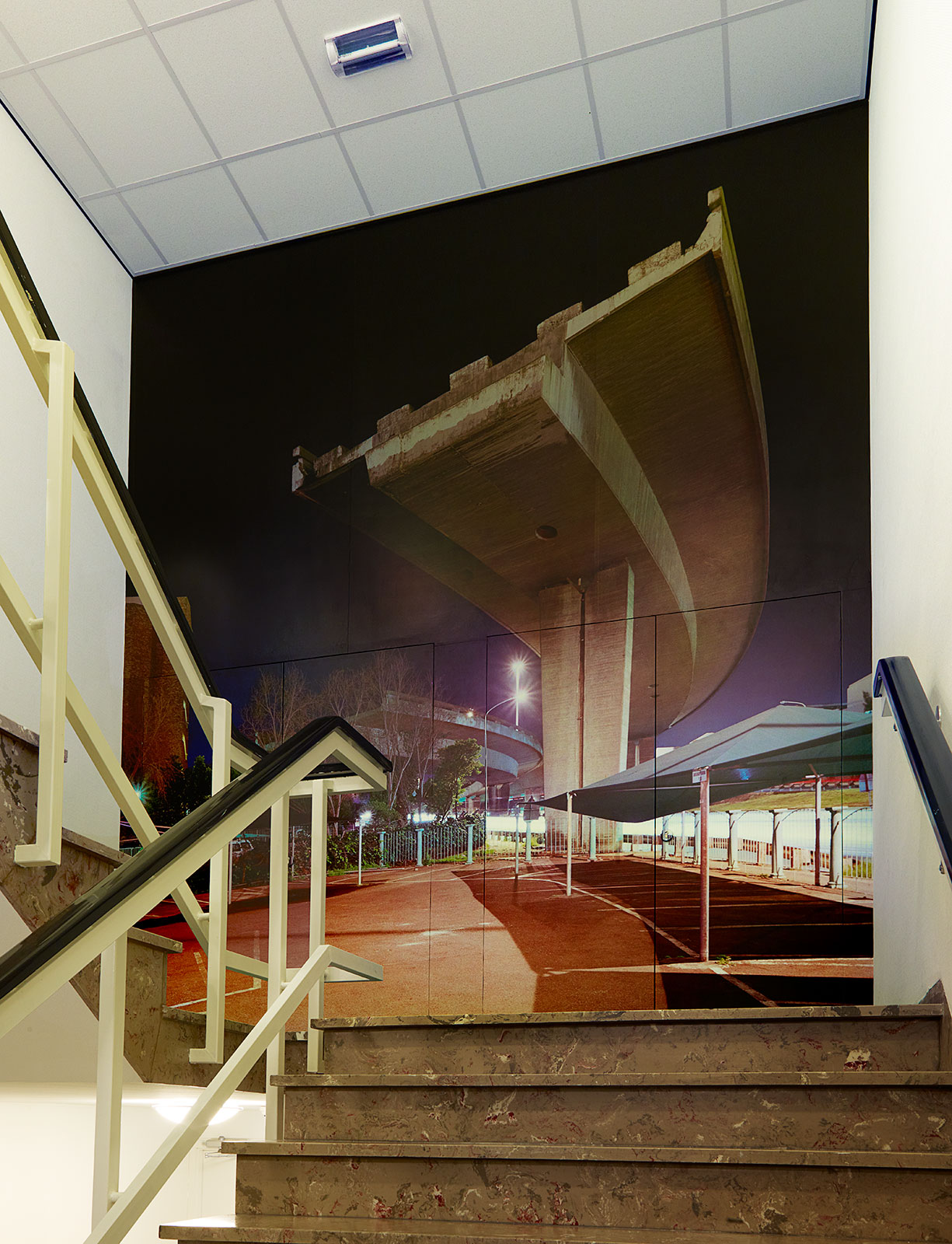
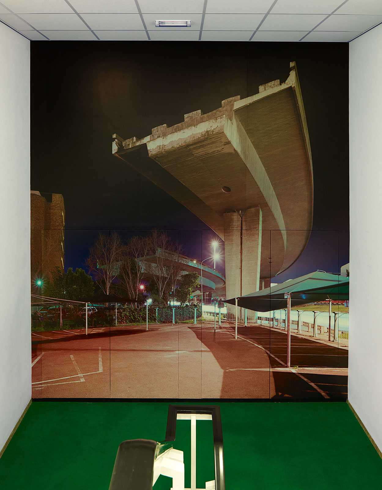
Photographer Hans Wilschut has made three monumental photographic works for the Rijkswaterstaat (Department of Public Works) Zeeland building in Goes. Works with a subtle intrinsic reference to the responsibilities of the organisation. Employees especially had to get used to the enormous, unfinished fly-over which protrudes from the staircase. A beautiful image, but for an organisation which, amongst others, also tackles motorways, a planalogical error of this size is difficult to stomach.
Because quite frankly. The non-descript building of the Rijkswaterstaat Zeeland in Goes is not the most exciting location for an artist. There is really nothing else to say about the two storey high building, situated on the edge of a residential area, besides that it is simply there. And nothing is really wrong with that. After all, not all of us can work in a designer box. And once you have entered the building, things become much more interesting. A recent, thorough renovation has freshened things up quite a bit. The result is a new division with modernised offices, skylights, a coffee counter, and so on. But the most remarkable thing is something else altogether. The visitor passing reception faces quite an entrance. An enormous, abruptly ending fly-over roars towards the visitor from the staircase.
Curiosity
It is an exciting image, especially for an organisation which is responsible for the maintenance, management and installation of (water) ways in the province of Zeeland. Because when you take a closer look at the wall-to-wall photographic work, you can see that the fly-over, photographed from below with a wide-angle lens is not frozen in its construction phase. Quite the contrary. Underneath the unfinished picket fence, an orderly laid-out parking lot, some of the spaces even covered by a tent. In the photograph, shot in the evening, a second fly-over can be detected behind a tree. Once again, constructing the fly-over was ended abruptly after the bend. A bit further down, an apartment building clearly blocks the way. It is obvious that these two motor ways will never know their final destination, but that they are doomed to a life as curious example of larger-than-life, planological errors in the urban environment.
Well, in the eyes of the Dutch beholder that is. Photographer Hans Wilschut made the work in the South-African Cape town. The bends of the two fly-overs were miscalculated at some point. When the “mistake” was discovered during the building process, construction works were simply stopped, and the two picket fences, albeit quite unexpectedly, became part of the urban environment. Apparently something people do not really care about elsewhere. In the Dutch, with Swiss precision created public area, where remnants and jagged edges are fought like weeds, an unthinkable situation. Not really surprising, this work initially provoked quite some resistance and mixed feelings amongst employees, according to Wilschut. Does it not rattle visitors too much when they encounter this as first impression when entering the building? Is it not too much anti-publicity for the organisation? Should not any mistake be avoided, clarifying explicitly that it does not concern “own work”?
Visual question marks
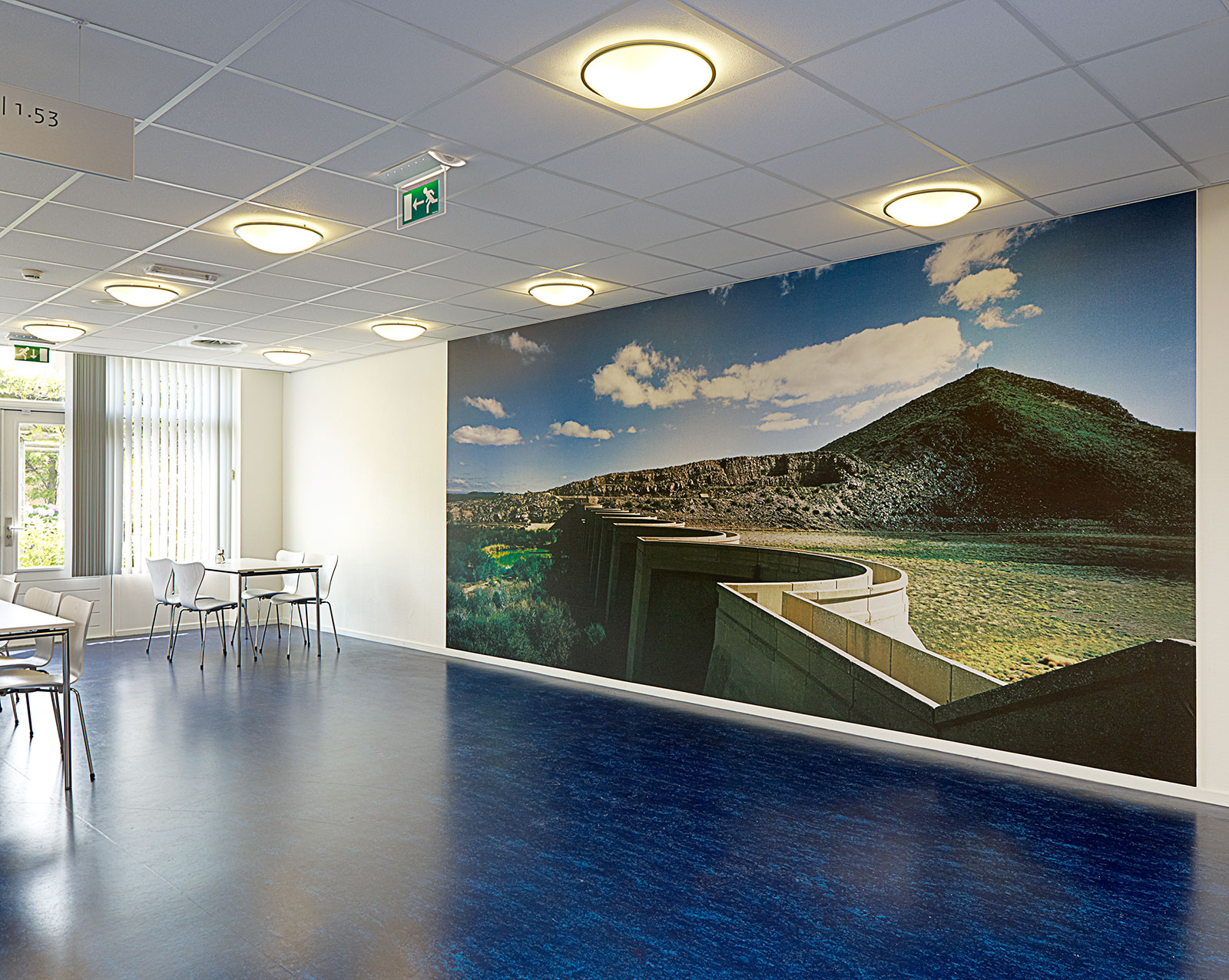
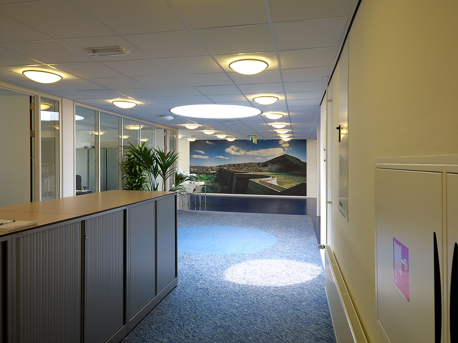
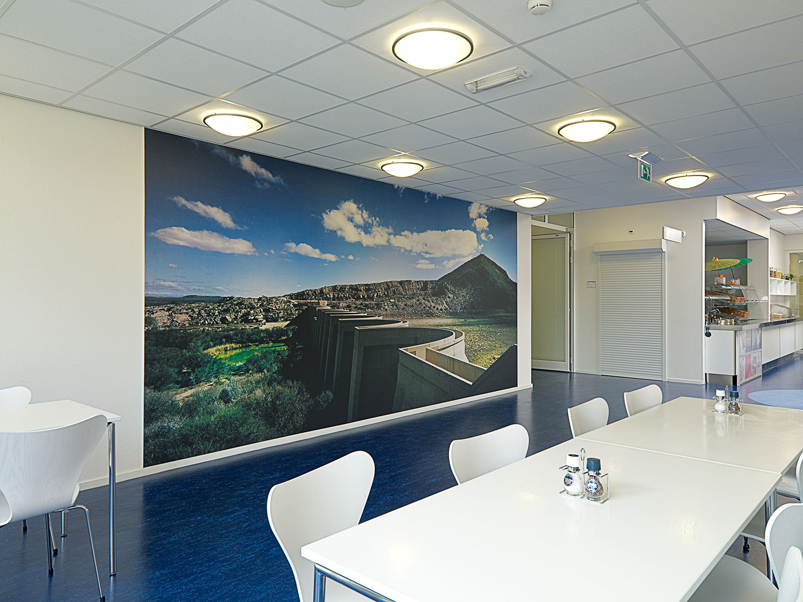
The second work by Hans Wilschut, which takes place at the end of the hall of the department water, also shows a rather un-Dutch situation. A wide panorama (where three takes have been assembled into a single image) of a huge dam, unemployed in a literally emptied scenery. We are in the Karoo desert in South-Africa. An endless, dry area stretching from the inlands of the Eastern Cape to the Indian Ocean, covering almost one third of South-Africa. The absolutely pointless dam in this “country of the big thirst”, the native meaning of Karoo, clashes vehemently with the numerous indispensable locks and dams in our country.
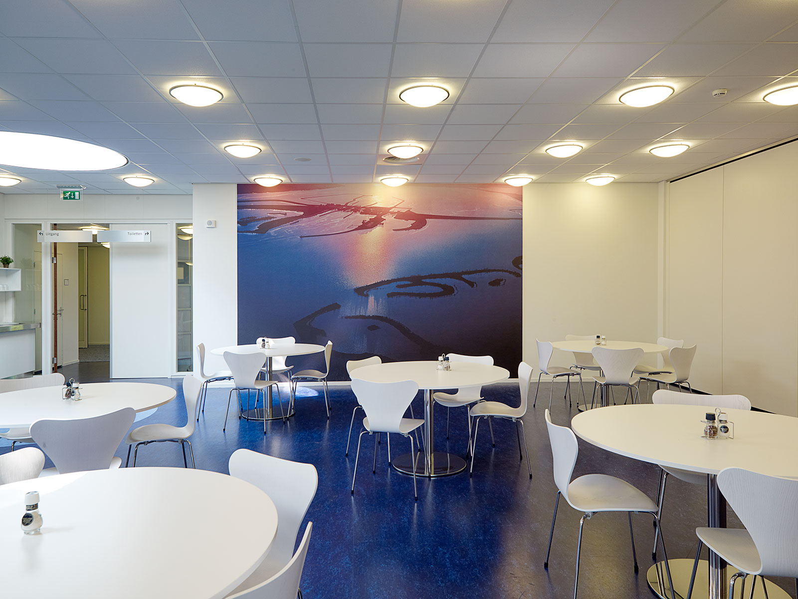
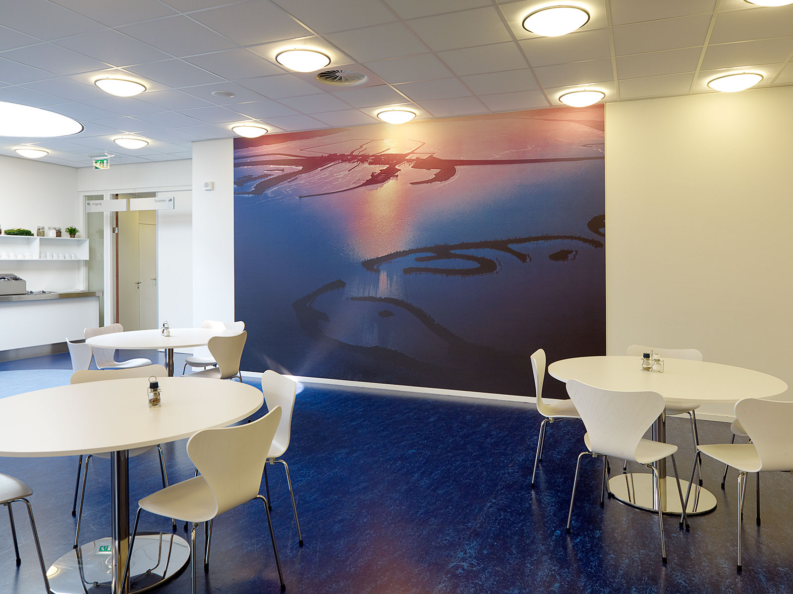
Such as for instance the Zeeland Krammersluizen (locks), topic of the third photographic work by Wilschut, decorating one of the other walls in the corporate restaurant. But whereas the other two works show themselves as visual question marks of the shown scenery, Wilschut passes by function and objective in this work. He shows the lock complex, situated in the Philips dam, not in its daily, clever glory, but turns it into an almost abstract image. The lock complex, photographed at sunset from an airplane, is reduced to an interplay of lines of dark contours in a glistening sheet. The black locks with their bulges seem Chinese characters. The single typically Dutch shot of the three works has become as exotic as the South-African images of the fly-overs and the dam in the hands of Wilschut.
Peeping Tom urban environment
In his assignment, Wilschut clearly concentrated on the “wet” and “dry” functions of Rijkswaterstaat. The photographic works are images which subtly, yet tantalizing, refer to the nature and responsibilities of the organization. This layered approach is typical for the work by Hans Wilschut. In his photographic works of (nocturnal) urban and industrial settings ” think untamed urban over-growth in Asia, Africa and wealthy petrol states” a social layer can also be found. Wilschut, unlike many other photographers of urban environments, is not interested in purely aesthetical or digitally manipulated truths. Properly looked at, urban reality offers sufficient remarkable shots. Wilschut is a proper Peeping Tom. And a slow one. Wilschut often visits locations various times and the use of a technical camera is a time-consuming process. Apparently impossible perspectives in his images are not digitally manipulated, but the result of old-fashioned guts. Climbing a high arch of a bridge or the roof of an apartment building is simply part of the job for Wilschut.
It is a poetic rather than a prosaic working process, which finds its reflection in the character of his work. In essence, Wilschut in his photographic work avoids the physical town as mere sum of bricks, glass and concrete. He goes beyond the speedy fascade architecture and shows us the true colours of urban reality: a picture book filled with human desire, fear, pre-occupation and failure.
